Skip table of contents

Performance Reports

How to locate Revenue Reports: Redbox Management → Reports → Performance

Performance Reports are only available for Marketplace Admin users and above.

Introducing New Performance Reports

We’ve added three powerful new reports to help you monitor performance, spot issues early, and work more effectively with outlets and delivery partners across your marketplace. These tools give you the insight you need to improve reliability, reduce operational noise, and keep customers happy.

  • Rejections by Outlet – See which outlets are rejecting the most orders, and whether those rejections are manual (e.g. out of stock or too busy) or automatic (e.g. terminal not answered). High rejection rates often indicate training gaps, technical issues, or a need for delivery window adjustments.

  • Refunds by Marketplace – Review all refunds issued across your marketplace, with late refunds (those issued outside the billing period) clearly highlighted. This helps you manage discrepancies between invoices and payouts, and spot outlets that may be refunding more than expected.

  • Delivery Failures by Marketplace – Track orders that failed due to issues on the delivery network’s side (such as driver cancellations or no-shows). The report shows performance by marketplace, and lets you drill down into specific orders to identify problem hotspots.


Rejections Report

The Rejections Report helps you monitor how many orders are being rejected by each outlet on your marketplace, and whether those rejections are manual or automatic. A high rejection rate can damage customer confidence and reduce repeat business, so this report is a key tool in identifying which outlets may need support.

Screenshot 2025-06-26 at 11.26.19.png

What it shows

For each outlet, the report displays:

  • Orders: The total number of orders placed during the selected time period.

  • Total Rejected: How many of those orders were rejected, with both a count and a percentage rate.

  • Manually Rejected: Orders the outlet actively rejected, usually due to being out of stock or too busy.

  • Automatically Rejected: Orders that timed out without being accepted (e.g. the terminal rang out), often due to technical issues or staff not being present when opening hours begin.

You’ll also see percentage changes from the previous period, shown in red or green depending on whether the rejection rate has gone up or down.

Outlet Rejection Heatmaps

Clicking on an outlet name in the Rejections Report opens a detailed heatmap view, helping you spot patterns in rejection behaviour by day and time.

Screenshot 2025-06-26 at 13.50.48.png

You can switch between metrics using the dropdown, including:

  • Auto Rejection Rate

  • Manual Rejection Rate

  • Total Rejection Rate

  • Rejected Orders

  • Rejected Order Value

Each heatmap shows activity across the week, hour by hour, with darker colours indicating a higher percentage of rejections. This makes it easy to spot operational trends and troubleshoot specific problem windows.

What to look for

  • Auto rejections early in the day may suggest the outlet isn’t present when their listed opening times begin, a sign that their trading hours need adjusting.

  • High rejection rates during peak hours might indicate staffing or capacity issues.

  • Manual rejection clusters could suggest recurring stock availability problems.

Use these visual cues to have more targeted conversations with outlets and help improve their reliability on the platform.

How to use it

  • High manual rejections may indicate that:

    • The outlet doesn't know how to mark items as out of stock on their menu.

    • They are overwhelmed during busy periods and need their order limits or delivery windows adjusted.

  • High automatic rejections usually suggest:

    • The outlet isn’t hearing the terminal or isn’t present when orders begin arriving.

    • They may need support checking their hardware, volume levels, or opening times.

What’s ideal?

Rejections should be as low as possible. If you notice consistently high rejection rates, especially with a rising trend, it’s worth reaching out to the outlet to help diagnose the issue.


Refunds Report

The Refunds Report gives you visibility over all refunds issued across your marketplace, and flags those that were processed outside the original billing period.

It’s a useful tool for spotting patterns, keeping outlet behaviour in check, and maintaining financial accuracy between invoices and payouts.
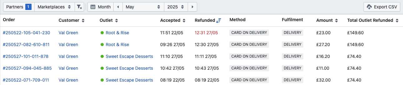
Screenshot 2025-06-26 at 11.55.40.png

What it shows

For each refunded order, the report displays:

  • The original order date

  • The refund date

  • The refunded amount

  • Whether the refund was issued within or outside the original billing period (late refunds are highlighted in red)

Why late refunds matter

Redbox operates on a Monday–Sunday billing week, with invoices and payouts issued the following Monday.

Here’s the issue:

  • If an order is refunded after the billing week it belonged to, it won’t be removed from the original invoice (which has already been issued), but will reduce the next payout to the outlet.

  • This creates a mismatch: the outlet’s earnings for one week are overstated on the invoice, and reduced in the following week’s payout.

You can use this report to spot these late refunds and, if needed, issue manual receipts or notes to keep financial records tidy.

Monitoring refund behaviour

Aside from timing, this report also helps identify outlets that are refunding too frequently.

  • A high refund count could suggest:

    • Operational issues (e.g. food quality, missing items, delivery delays)

    • Abuse of the refund system

    • Staff training or reliability problems

You should keep the overall refund volume low across the marketplace, and consider checking in with any outlets that issue refunds regularly or in high value.

Best practice

  • Encourage outlets to refund within the same billing week when possible; this keeps payouts and invoices aligned.

  • Review this report weekly to stay ahead of refund trends and prevent issues from going unnoticed.


Delivery Failures Report

The Delivery Failures Report shows you how your delivery network is performing across each marketplace you manage. It highlights failed orders where the delivery network accepted the job but did not complete it, and the order ended up with the status “Delivery Network Failure.”

This report is key for identifying problem areas and working out whether failed deliveries are isolated incidents or part of a wider pattern.

Screenshot 2025-06-26 at 13.40.15.png

What it shows

The data is grouped by marketplace and includes:

  • Orders: Total number of orders handed to the selected delivery network

  • Value: Combined order value for those deliveries

  • Failures: Number of failed deliveries

  • Failed Value: Total value of those failed orders

  • Performance: Failure rate over time

You can filter by delivery partner (e.g. Uber Direct), and view the last 30, 60, or 90 days.

Dig deeper

Clicking on the order or failure counts will open a detailed order list, allowing you to see which specific orders failed. From there, you can spot whether:

  • A particular outlet is involved repeatedly

  • A driver behaviour pattern (like frequent cancellations) is emerging

Delivery Failure Heatmaps

Clicking on a marketplace name in the Delivery Failures Report opens a heatmap view, giving you a visual breakdown of delivery network performance by day and hour.

This lets you spot patterns in when delivery issues are most likely to occur, ideal for identifying recurring problems with driver availability, traffic bottlenecks, or operational mismatches.

Screenshot 2025-06-26 at 14.13.41.png

Available datasets:

  • Total Orders – Volume of orders passed to the delivery network

  • Total Failed Orders – Number of orders that reached the Delivery Network Failure status

  • Total Failed Value – Value of failed orders

  • Failure Rate – % of failed orders out of total orders

Each square represents one hour of the day. The darker the red, the more failures occurred at that time. Yellow tones indicate fewer or no issues.

What to look for:

  • Clusters of red at certain times may indicate:

    • Poor driver availability during those windows

    • Traffic or access issues tied to specific hours (e.g. school pickup time)

    • Delivery network underperformance during peak times

  • High failure rates but low order volume might suggest that even a small number of jobs are proving too difficult at specific times — perhaps due to outlet location or delivery radius.

This insight allows you to raise issues with the delivery partner, adjust delivery hours, or advise outlets on making pickups easier for drivers.

Why this matters

Delivery network failures often result in refunds and a poor customer experience, even when the outlet did everything right. Repeated failures in one marketplace could be due to:

  • A hard-to-reach pickup location

  • Access issues for drivers (e.g. parking, building layout)

  • Low availability or high cancellation rates from the network’s drivers

What to do

  • Investigate failures in your delivery partner’s dashboard to understand why they occurred.

  • If failures are concentrated around one outlet, consider adjusting:

    • Pickup instructions

    • Lead times

    • Opening hours

  • In extreme cases, you might explore alternative delivery networks or delivery coverage tweaks for certain areas.

JavaScript errors detected

Please note, these errors can depend on your browser setup.

If this problem persists, please contact our support.