Every Redbox Marketplace has branding that we apply to your mobile app, ordering website and terminal receipts. The management Portal and Terminals are branded with Redbox branding only.
Mobile App Branding
Your Android and Apple mobile apps will require the following branding:
-
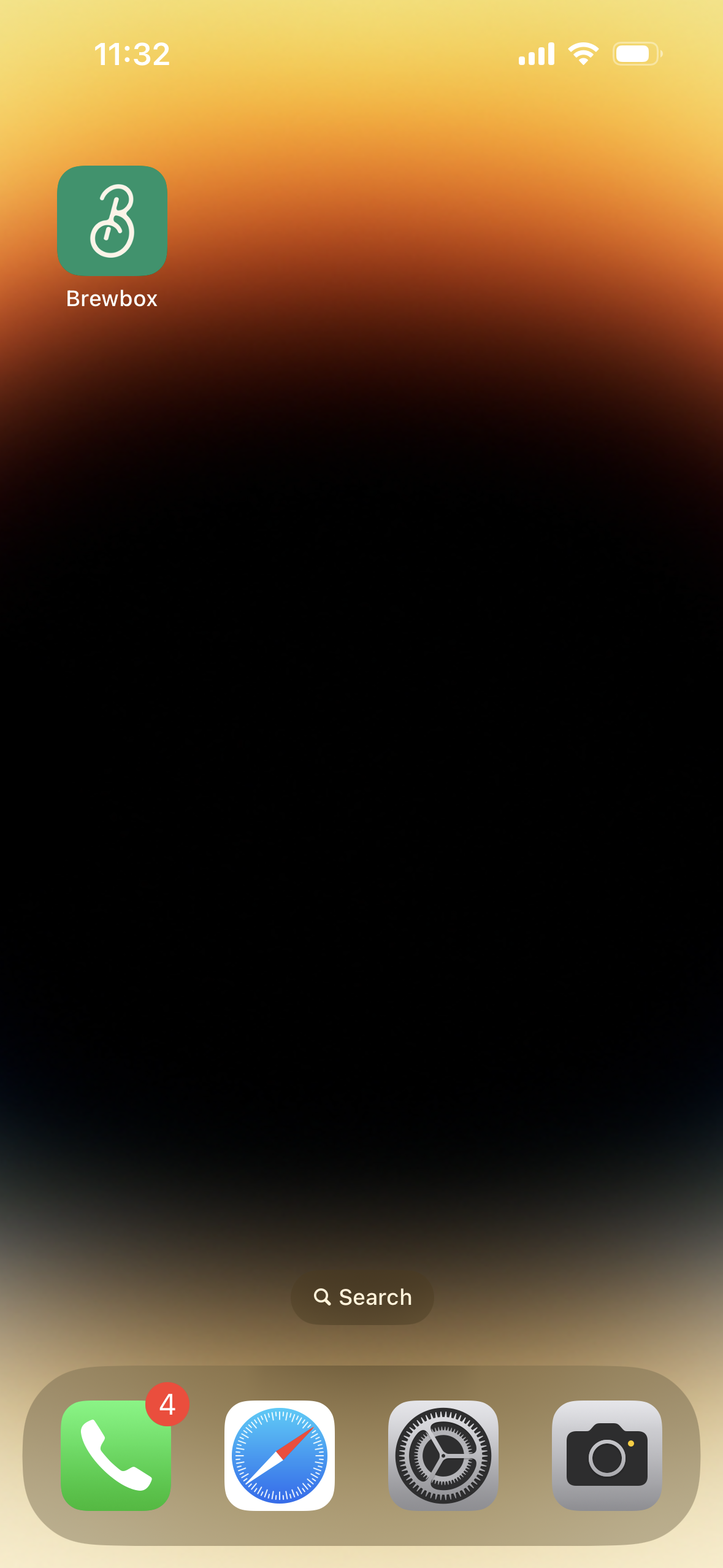
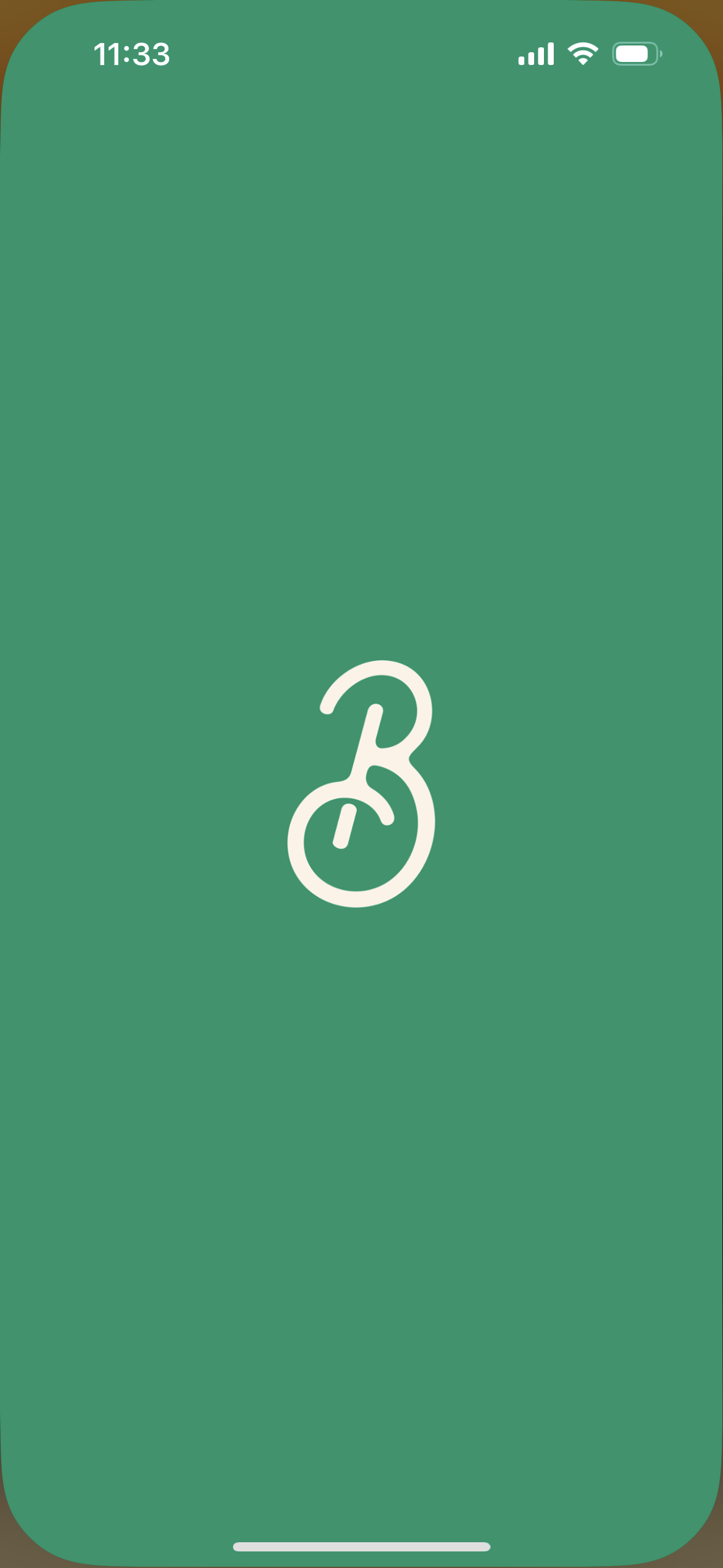
Branding which will work over a solid primary colour as an app icon. This branding is normally a simple version of your full branding without any words, as your app tile will display wording beneath when shown on your customer's home screen. This final tile should have an aspect ratio of 1:1 with some room around the branding, as the majority of app tiles are square with various levels of rounding on the corners depending on the device (on some android devices app tiles are circles).
-
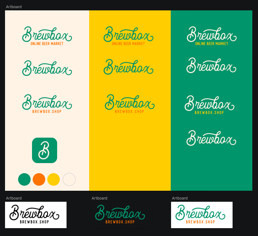
In the examples below the Brewbox app tile branding is a cream-coloured 'B' over forest green.
-
Primary colour which your branding works over, and also is suitable for your splash screen and app header. App tiles cannot have a gradient background as the same image is used for your app splash screen which is a solid colour.
-
In the examples below the primary colour is
#00956Awhich is forest green.
-
-
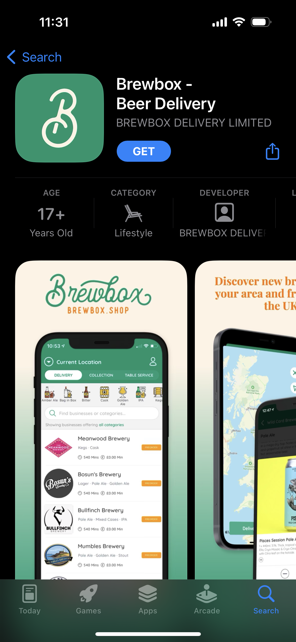
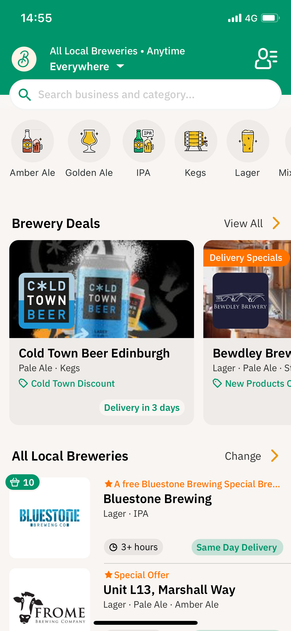
Full branding and hero image which is used at the top of the login screen. Your full branding will display over this image and can be your white or pale-coloured branding or full colour, as long the branding is visible over the hero image.
-
In the examples below the hero image is a dark-coloured image of beer bottles overlaid with full-colour branding.
-
Ordering Website Branding
Your ordering website will require the following branding:
-
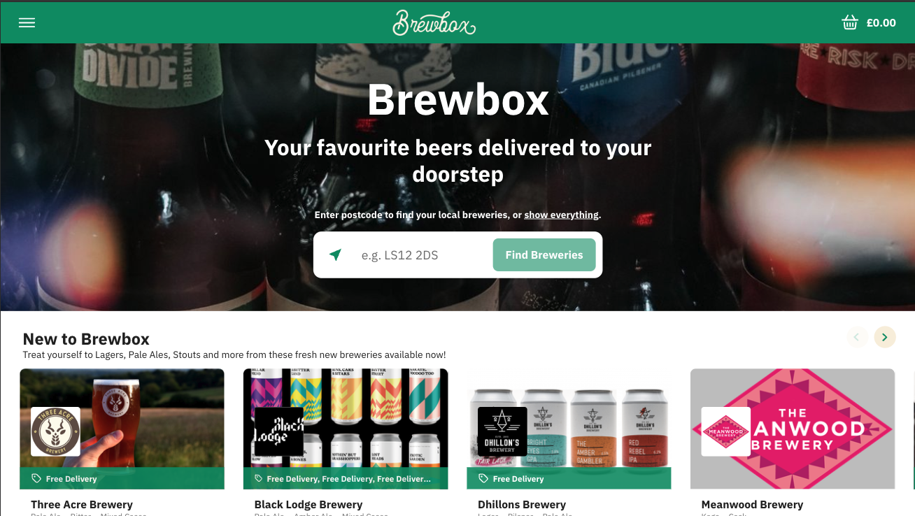
Branding which works over your hero image and also in your coloured header bar. This branding is normally your full branding in white with a transparent background, to ensure it works over your hero image. This ensures it also works over your primary colour which is displayed in the header bar when the user scrolls down the page on mobile web. Other pale colours over a dark header colour can also work, for example, the Brewbox branding is pale cream on forest green.
-
This branding should be longer than it is tall, with an aspect ratio of around 4:1.
-
This branding doesn't normally include a strap line as the text would be too small to read.
-
In the examples below the Brewbox branding is a cream-coloured branding with a transparent background, which is 402px x 126px.

-
-
A hero image. Your hero image should be dark enough in the top third of the image, to ensure the branding is visible on all devices.
-
In the examples below the hero image is a dark image of bottles of beer.
-
-
A primary colour which is used on buttons and in your header on mobile web. This is normally the same colour as your app tile background and primary colour on the mobile app.
-
In the examples below the primary colour is
#00956Awhich is forest green.
-
-
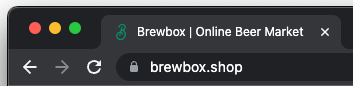
A very small version of your branding which will be used as your favicon for the ordering website. This tiny graphic shows in the users browser bar and should work in dark and light mode. It should be 120 x 120px and can be transparent. If your favicon branding is dark and will only be visible in light mode, you could consider adding a white circle behind your branding so it is also visible in light mode.
-
The brewbox favicon is a small green 'B'.
-
Receipt Branding
Your branding also needs to work at the top of the receipts that are printed on your business’s terminals. This should be a black-and-white version of your branding and could include a strapline. This branding should have an aspect ratio of around 2:1.
In the example below the Brewbox branding for the receipt is the full branding with a strapline, in black on a white background.

Getting Help with your Branding
You can send a link to these guidelines to your graphic designer, to ensure the branding created is suitable for Redbox. You may also require other variations of your branding which you can use on social media and other marketing channels, for example, a full-colour version of your branding for use on white and branding with a strapline.
For example here is the full branding pack for Brewbox, which includes a suite of colours and branding that is suitable for the app icon, website, and also printed media and social media. Branding has been provided that works on white, black, green, yellow and cream, and also branding with and without a strap line. App icon is also considered and uses the 'B' from the full branding.