
Web Theming
To locate website theming: Redbox → Marketplaces → Branding
Your site supports a detailed, customisable theme that can be set in Redbox Management.
When selecting light or dark colours, make sure to choose options that provide enough contrast — these colours will often appear behind text, so clear readability is essential. Changes to your theme may take up to an hour to display on your website.
To set your theme, each field will accept a hex code of the colour you would like to set. You can also click on the colour thumbnail to use a colour picker. Once you've made the changes you want, select the 'Save' button to make sure any changes have been applied successfully.
If you want to revert to the original colour palette, simply select the 'Reset' button and all the colour codes will reset to the default.
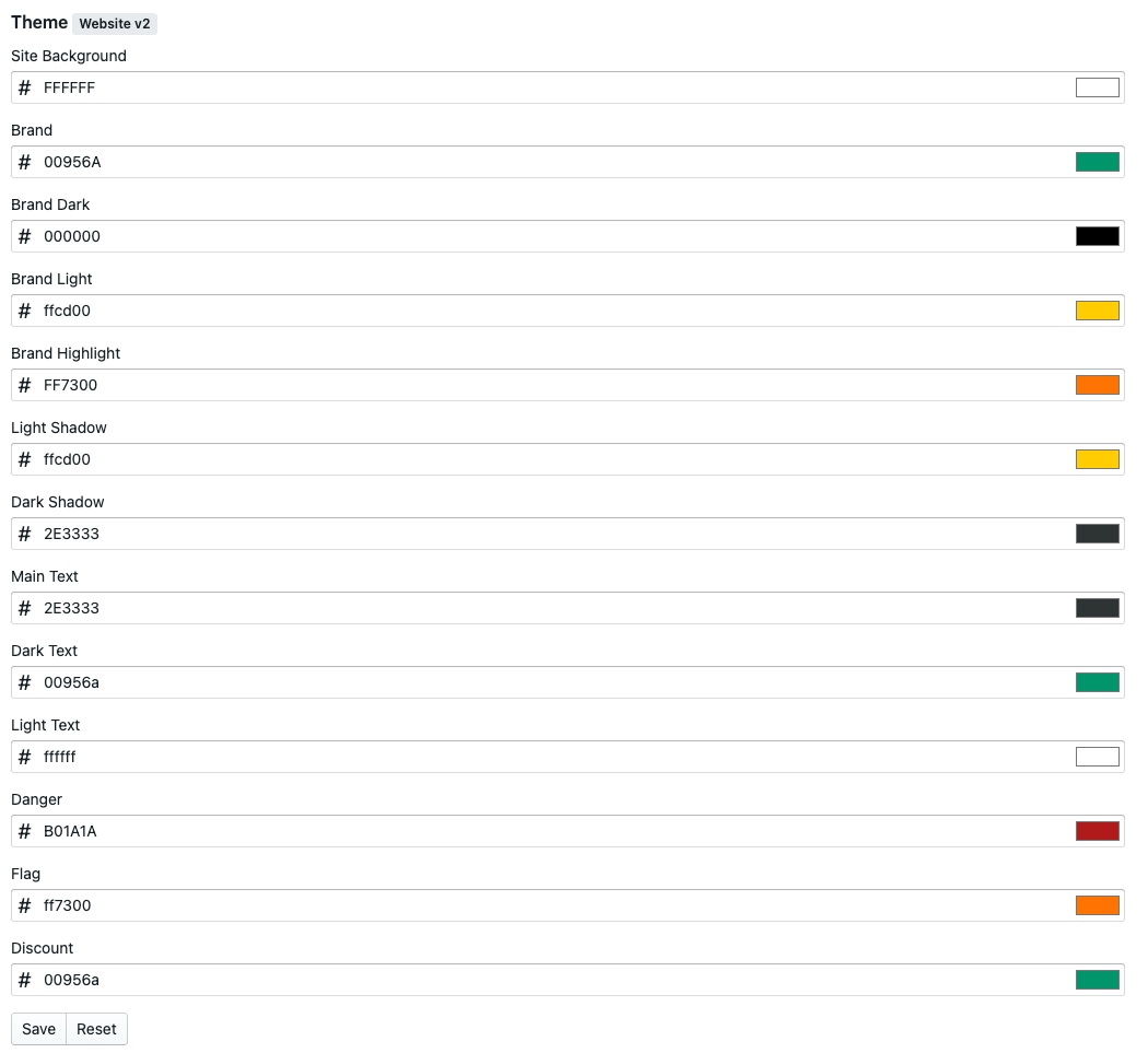
Setting | Details |
|---|---|
Site Background | Used as the background of your site, white or a pale colour works best. |
Brand | Your main brand colour, used in the main header and on buttons. |
Brand Dark | Used on titles |
Brand Light | Used as the background of the service picker and in the footer. |
Brand Highlight | Used when you hover over a segment card. |
Light Shadow | Used as the border on the service picker. |
Dark Shadow | Used as a shadow colour under the service picker. |
Main Text | Used as the main text colour, normally a dark colour. |
Dark Text | Used where dark text is needed over a colour that isn't white. |
Light Text | Used where light text is needed over a colour that isn't white. |
Danger | Applied to warnings in forms and in checkout, should be a shade of red. |
Flag | Used for outlet flags on segments, outlet cards and on the outlet menu view. This colour needs to work as a background for white text and also as a stand alone text colour. |
Discount | Used for discounts on segments, outlet cards and on the outlet menu view. This colour needs to work as a background for white text and also as a stand alone text colour. To help customers identify which text is flags and which are discounts its worth making this colour different to the flag colour. |
Open / Order Status | Used for opening status buttons and full text on the outlet cards on the home page, outlet list and on the outlet menu when the outlet is currently open. |
Preorder Status | Used for opening status buttons and full text on the outlet cards on the home page, outlet list and on the outlet menu when the outlet is currently offering preordering. |
For a positive customer experience, you need to make sure your colour choices improve readability. Using unsuitable colours on buttons or text can make the navigation and content on your website challenging for your customers and can impact their ability to use it.